
Context
Users: Students (primary + secondary), teachers, parents, clinicians
Business goal: Create a compliant, scalable screening platform that translated clinical methods into usable digital experiences.
Strategic Problem
Detection relied on slow, paper-led processes
No real-time, population-level visibility
High psychological barriers to help-seeking
Existing tools lacked clinical or child-specific design integrity
Constraints
Clinical validity could not be compromised
High privacy and safeguarding requirements
Shared-device environment (iPads)
Multi-stakeholder complexity (education + clinical + tech)
What I Led
Product Strategy
Defined product architecture across three user surfaces
Balanced clinical rigour with usability and engagement
Set behavioural design principles to reduce stigma and friction
Research Direction
Shaped research plans with clinical psychologists
Interpreted qualitative findings into product decisions
Oversaw school-based testing strategy
Experience Design
Designed:
Child-first interaction models
Adult-specific observation tools
Clinician-ready data visualisation dashboards
Established guardrails:
Removed default response bias
Built age-appropriate language frameworks
Outcomes
Deployed in real-world school environments
Enabled earlier detection of wellbeing risks
Increased student engagement and disclosure
Improved educator confidence in escalation decisions
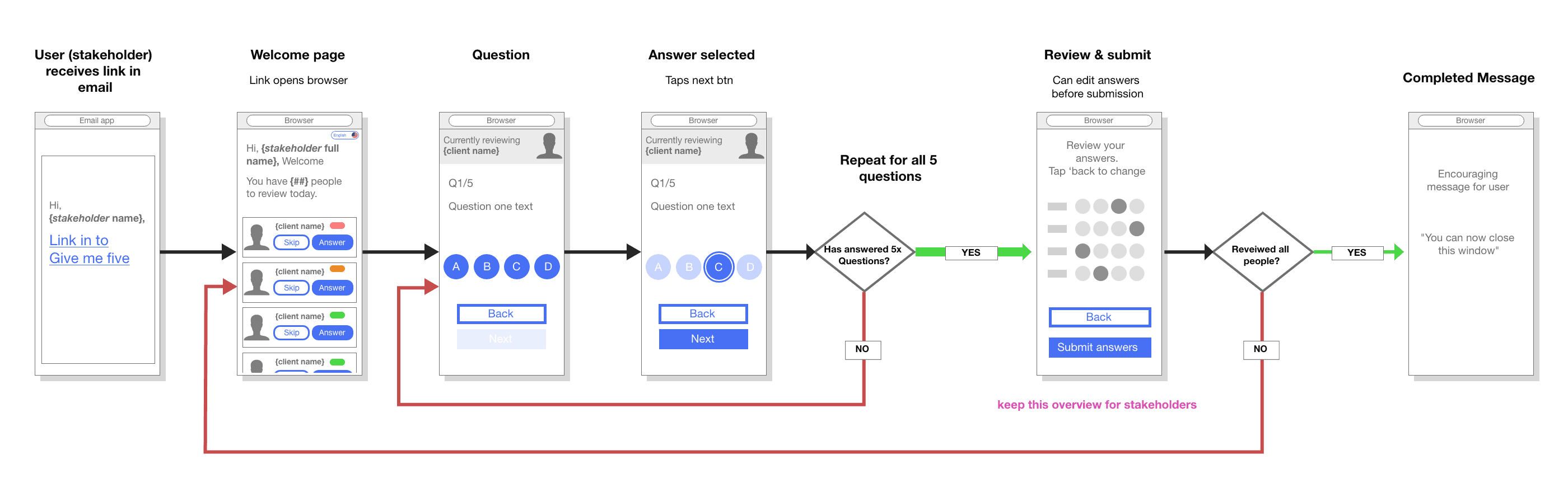
We set out to create a simple, digital way for young people to check in on their mental health.
Working in mental health is different to most product challenges. Small details really matter — the words you use, the tone of the interface, even the colours on screen can change how safe someone feels engaging with it.
Designing for children adds another layer of complexity. You’re balancing clarity, trust, and emotional safety, while keeping the experience intuitive, engaging, and age-appropriate.

What I’d Take Further
Design longitudinal mental health trend tracking
Introduce adaptive, risk-based questioning
Develop passive behavioural indicators
Expand neurodiversity and accessibility
Process Deep Dive
Why these designs didnt work
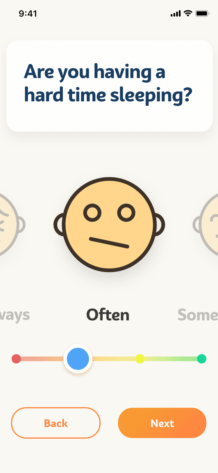
This slider interaction relies on having a default selection.
In user testing, students would blast through the questions without any consideration, skewing & invalidating the results.
Why this designs didn't work
This slider interaction relies on having a default selection.
In user testing, students would blast through the questions without any consideration, skewing & invalidating the results.
Problems with this design:
While space saving, multiple questions on one page, causes confusion for users

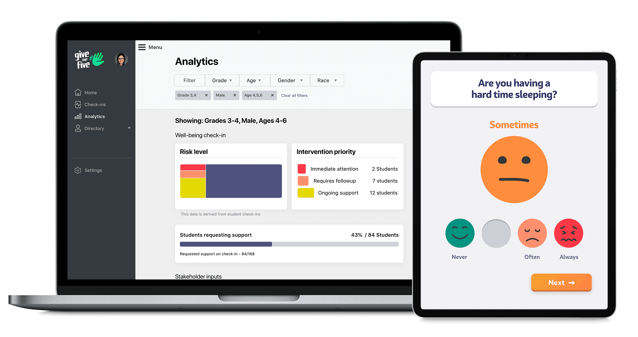
Counsellor's Dashboard
Dashboard view for school staff & clinicians → overview + deep dive

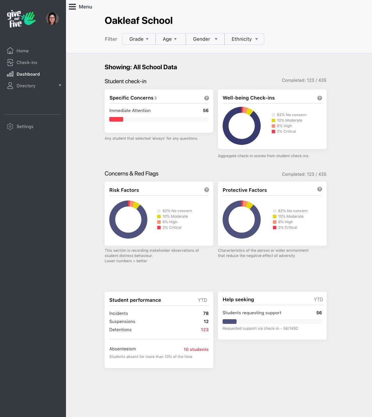
High res prototype → Counsellor's dashboard.
Shows the overall health of the school at a glance
